I downloaded The official Length of Day Delta (LODD) data so that I could do a more detailed analysis on the correlation between water vapor and the LODD I discussed here. I parsed up the data and added it to my working copy of the Climate Scientist Starter Kit Spreadsheet.
What I found is the correlation is not as good as I first thought it was. Or maybe a better way to say it is the correlation is different than I first thought it was. There seems to be two correlations in the data.
Just to be clear, I'm not suggesting that changes in the LODD are causing changes in water vapor. I'm pointing out that there are correlations between the two data sets.
What Is Length Of Day Delta (LODD)?
Let's start with an explanation of what the Length Of Day Delta (LODD) is. Simply put, the LODD is a measure of how much extra time is added to each day. A "normal" day has 86,400 seconds. However, in practice, there's no such thing as a normal day. Each day has a few more or a few less milliseconds. The extra amount of time, which can be positive or negative, is the LODD.
Water Vapor And LODD, 1983 To 2008
The graph above shows water vapor (blue lines) and LODD (green lines) data for the period of July, 1983 to June, 2008. There's a 13 month running mean added to smooth the data.
As you can see, the correlation doesn't look as nice as when I just overlaid two graphs in my previous post. Specifically, in the early years water vapor is not matching LODD. I was a bit bummed out when I saw this, thinking a correlation that looked so promising turned out to be nothing.
But I kept looking and found something else: two correlations.
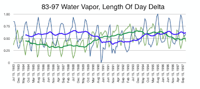
Water Vapor And LODD, 1983 To 1997
The first correlation runs through the first half of the data, from July 1983 to December, 1997. In this correlation the water vapor (blue lines) and LODD (green lines) are mirror images of each other. As one goes up, the other goes down. This is true both at the monthly level and at the 13 month smoothed trend.
Water Vapor And LODD, 1998 To 2008
The second correlation runs through the second half of the data, from January, 1998 to June, 2008. In this correlation water vapor (blue lines) and LODD (green lines) follow each other in the 13 month smoothed trend, even though at the monthly level they are still have reversed trends.
What's It All Mean?
The honest answer is "I don't know". Maybe there's something to this, maybe not. But the two correlations seem pretty clear.
One thing that jumps out at me is that 1998, when the new smoothing trend starts, is when the Earth stopped warming.
I'll continue to research this to see what I find and post updates here.
References:
Earth Orientation Centre Length of Day Delta (LODD) data
Stunning New Climate Correlation
Climate Scientist Starter Kit Spreadsheet
Subscribe to:
Post Comments (Atom)


Very interesting.
ReplyDeleteHave you done the calculation on how much it changes the moment of inertia of earth when a bunch of water moves from the surface upwards a couple of miles.
I don't think that there enough difference that water vapor going up can make the earth spin faster like an ice skater pulling in her arms, but it is the simple explanation that should be calculated out first.
Good idea, Charlie. I'll look into that and post an update.
ReplyDelete