Showing posts with label Climate Scientist Starter Kit. Show all posts
Showing posts with label Climate Scientist Starter Kit. Show all posts
Monday, March 29, 2010
What Ozone Hole?
As a result of now being able to make movies from gridded data, I've been going through the ISCCP data that comes with the Climate Scientist Starter Kit. A movie of the ozone data is provided above.
What surprised me was the amount of ozone over Antarctica was equal to or greater than the amount of ozone over nearly the entire rest of the world. Only the Arctic consistently had more ozone (and it has quite a bit of ozone). This was true from the beginning of the movie (July, 1983) to the end (June, 2008).
Which makes me wonder why we've never heard of of an ozone hole over Africa, or South America, or India, all of which always have less ozone than Antarctica.
Now, I'm hardly an ozone expert. So if anyone out there would like to enlighten me on why this all makes sense, please feel free to do so. Because right now I'm wondering if the Ozone Hole is as big a hoax as Global Warming. Tips on why the Arctic has so much ozone are also welcome.
P.S.
If you watch the video all the way through, you get to see what happens when a satellite sensor goes batty.


Thursday, March 11, 2010
Climate Scientist Starter Kit v2.0 Coming, Part IV: Total Solar Irradiance, Sunspots, Regional Cosmic Rays
In this post we look at several new data sets being added to version 2.0 of the Climate Scientist Starter Kit: Total Solar Irradiance (TSI), Sunspots, and regional Cosmic Rays.
 Total Solar Irradiance (TSI)
Total Solar Irradiance is the amount of sunshine hitting the Earth's atmosphere at any given time. Version 2.0 of the Climate Scientist Starter Kit includes monthly TSI values taken from three satellites at three different frequencies. This data extends from February, 1996 to October, 2009.

Sunspots
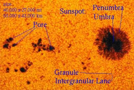
 Version 1.5 of the Climate Scientist Starter Kit already has Sunspot Group data. Version 2.0 adds Sunspots. This data extends from January, 1749 to January, 2010.

Regional Cosmic Rays
Regional Cosmic Rays have been added to the existing Cosmic Ray data of version 1.5. With this added data, there is now at least one cosmic ray measurement for every region used by UAH when it publishes temperatures: Northern Hemisphere, Southern Hemisphere, Tropics, Northern Extra Tropics, Southern Extra Tropics, North Pole, South Pole, and the 48 U.S. continental states.


Previous Posts In This Series:
Climate Scientist Starter Kit v2.0 Coming
Climate Scientist Starter Kit v2.0 Coming, Part II: Regional Data
Climate Scientist Starter Kit v2.0 Coming, Part III: Ozone And Pressure

Total Solar Irradiance is the amount of sunshine hitting the Earth's atmosphere at any given time. Version 2.0 of the Climate Scientist Starter Kit includes monthly TSI values taken from three satellites at three different frequencies. This data extends from February, 1996 to October, 2009.

Total Solar Irradiance (TSI)
Sunspots

Sunspots
Regional Cosmic Rays
Regional Cosmic Rays have been added to the existing Cosmic Ray data of version 1.5. With this added data, there is now at least one cosmic ray measurement for every region used by UAH when it publishes temperatures: Northern Hemisphere, Southern Hemisphere, Tropics, Northern Extra Tropics, Southern Extra Tropics, North Pole, South Pole, and the 48 U.S. continental states.

Thule, Greenland (North Pole Region)

Swarthmore, Pennsylvania (U.S. 48 States, Northern Extra Tropics)

Climax, Colorado (U.S. 48 States, Northern Extra Tropics)

Haleakala, Hi (Tropics)

Hauncayo, Peru (Tropics)

Hermanus, South Africa (Southern Extra Tropics)

McMurdo, Antarctica (South Pole)

South Pole (South Pole)

McMurdo, Swarthmore, South Pole, Thule, Cosmic Rays

Previous Posts In This Series:
Climate Scientist Starter Kit v2.0 Coming
Climate Scientist Starter Kit v2.0 Coming, Part II: Regional Data
Climate Scientist Starter Kit v2.0 Coming, Part III: Ozone And Pressure
Sunday, February 21, 2010
Calculating Integrals In The Climate Scientist Starter Kit
Since I showed you how to calculate the derivatives of CO2, I figured I'd show you how to calculate the integral as well. Just like calculating derivatives, calculating integrals is surprisingly easy.
Calculating Integrals In The Climate Scientist Starter Kit
The first thing we need to know is just what an integral is. Another name for integral is "area under the curve", and that's just what an integral is, the area from the bottom of the graph to the place where the lines are. To demonstrate this visually, I plotted a graph that has CO2 twice, once as a line and once as a set of bars. The distance between the bars was set to zero. Here's what the graph looks like:
 You can see that when CO2 is plotted as a set of bars, it completely fills up the area under the curve of CO2 plotted as a line. This is exactly what an integral is! So we know there's enough information just from the CO2 values to get the integral. So how do we get the actual number value for the integral?
It's simple. We add up the values for all the bars. This can be done with a simple sum() function:
Done!
Calculating Integral Ranges
Suppose we want to find the integral of just part of the graph, say between the 5th and 10th months listed. This can be done by taking the integral for each range and subtracting the results.
The first function gives us the integral of columns 1 through 5. The second function gives us the integral of columns 1 through 10. Subtracting the first integral from the second integral gives us the integral of columns 5 through 10.
Previous Posts In This Series:
CO2 Derivatives (Not Al Gore's Kind Of Derivatives)
Calculating Integrals In The Climate Scientist Starter Kit
The first thing we need to know is just what an integral is. Another name for integral is "area under the curve", and that's just what an integral is, the area from the bottom of the graph to the place where the lines are. To demonstrate this visually, I plotted a graph that has CO2 twice, once as a line and once as a set of bars. The distance between the bars was set to zero. Here's what the graph looks like:

It's simple. We add up the values for all the bars. This can be done with a simple sum() function:
=SUM(COLUMN_NAME)Done!
Calculating Integral Ranges
Suppose we want to find the integral of just part of the graph, say between the 5th and 10th months listed. This can be done by taking the integral for each range and subtracting the results.
=SUM(COLUMN_NAME_ROW_1:COLUMN_NAME_ROW_OF_FIRST_VALUE)

=SUM(COLUMN_NAME_ROW_1:COLUMN_NAME_ROW_OF_SECOND_VALUE)

=SECOND_INTEGRAL - FIRST_INTEGRAL


Example:

=SUM(C1:C5)

=SUM(C1:C10)

=SECOND_INTEGRAL - FIRST_INTEGRAL
The first function gives us the integral of columns 1 through 5. The second function gives us the integral of columns 1 through 10. Subtracting the first integral from the second integral gives us the integral of columns 5 through 10.
Previous Posts In This Series:
CO2 Derivatives (Not Al Gore's Kind Of Derivatives)
Friday, February 19, 2010
CO2 Derivatives (Not Al Gore's Kind Of Derivatives)
A few days ago an article appeared on What's Up With That that claimed to have disproven AGW using statistics. That claim seems rather bold to me, but there were aspects of the paper I found interesting.
The paper talked about the "1st differences" and "2nd differences" of CO2. By this, the author meant the 1st and 2nd derivatives of CO2. Here I mean derivative as the term is used in Calculus, not the CO2 financial derivatives Al Gore wants to sell you on his carbon stock exchange.
This post shows how to calculate the 1st and 2nd derivatives of a variable in the Climate Scientist Starter Kit.
Calculating Derivatives In The Climate Scientist Starter Kit
It turns out it's pretty easy to calculate 1st and 2nd derivatives in the Climate Scientist Starter Kit. A derivative is calculated as dy/dx. In English, this means the change in y divided by the change in x. In this case, the term "y" refers to the y axis and "x" refers to the x axis. So you can calculate a derivative with the following spreadsheet formula:
But its actually even easier than that. Because the X axis represents a series of months, the difference between any two adjoining X values is always 1. This simplifies the formula to:
And because the result of any number divided by one is that number, the formula simplifies even further:
And there's our derivative!
Calculating the 2nd derivative is just the process of getting the derivative of the first derivative. In other words, it's just the same (Y_CELL - Previous_Y_Cell) run against the 1st derivative rather than the original data series.
The 1st And 2nd Derivative Of CO2
The graphs below show the CO2 data from the Climate Scientist Starter Kit, and the 1st and 2nd derivatives of that data.


The 1st derivative tells us the rate of change in the amount of CO2. The 2nd derivative tells us the rate of change in the rate of change in the amount of CO2.
Conclusion
Originally, I had planned to show how the 2nd derivative of CO2 has a good match with changes in cosmic rays. To do this you just lay the normalized cosmic rays on the graph with the 2nd derivative of CO2.
I had done this very quickly with a couple of decades of data when I first read the article I mentioned above. The match was very good. The 2nd derivative of CO2 and cosmic rays changed in lockstep with one another. Unfortunately, when I extended the analysis to the full range of data for the purposes of writing this post, the new range didn't have that nice correlation.
So I have no cool correlation to show you, but now you know how to calculate 1st and 2nd derivatives of data in the Climate Scientist Starter Kit. Well, ok, I do have one correlation to show you. It's between the 1st derivative of CO2 and the Solar Ephemeris. A similar correlation also exists with the 2nd derivative of CO2.

References:
New paper on mathematical analysis of GHG
Climate Scientist Starter Kit v1.5
The paper talked about the "1st differences" and "2nd differences" of CO2. By this, the author meant the 1st and 2nd derivatives of CO2. Here I mean derivative as the term is used in Calculus, not the CO2 financial derivatives Al Gore wants to sell you on his carbon stock exchange.
This post shows how to calculate the 1st and 2nd derivatives of a variable in the Climate Scientist Starter Kit.
Calculating Derivatives In The Climate Scientist Starter Kit
It turns out it's pretty easy to calculate 1st and 2nd derivatives in the Climate Scientist Starter Kit. A derivative is calculated as dy/dx. In English, this means the change in y divided by the change in x. In this case, the term "y" refers to the y axis and "x" refers to the x axis. So you can calculate a derivative with the following spreadsheet formula:
=(Y_Cell - Previous_Y_Cell) / (X_Cell - Previous_X_Cell)But its actually even easier than that. Because the X axis represents a series of months, the difference between any two adjoining X values is always 1. This simplifies the formula to:
=(Y_Cell - Previous_Y_Cell) / 1And because the result of any number divided by one is that number, the formula simplifies even further:
=(Y_Cell - Previous_Y_Cell)And there's our derivative!
Calculating the 2nd derivative is just the process of getting the derivative of the first derivative. In other words, it's just the same (Y_CELL - Previous_Y_Cell) run against the 1st derivative rather than the original data series.
The 1st And 2nd Derivative Of CO2
The graphs below show the CO2 data from the Climate Scientist Starter Kit, and the 1st and 2nd derivatives of that data.

CO2 Data

CO2 1st Derivative

CO2 2nd Derivative
The 1st derivative tells us the rate of change in the amount of CO2. The 2nd derivative tells us the rate of change in the rate of change in the amount of CO2.
Conclusion
Originally, I had planned to show how the 2nd derivative of CO2 has a good match with changes in cosmic rays. To do this you just lay the normalized cosmic rays on the graph with the 2nd derivative of CO2.
I had done this very quickly with a couple of decades of data when I first read the article I mentioned above. The match was very good. The 2nd derivative of CO2 and cosmic rays changed in lockstep with one another. Unfortunately, when I extended the analysis to the full range of data for the purposes of writing this post, the new range didn't have that nice correlation.
So I have no cool correlation to show you, but now you know how to calculate 1st and 2nd derivatives of data in the Climate Scientist Starter Kit. Well, ok, I do have one correlation to show you. It's between the 1st derivative of CO2 and the Solar Ephemeris. A similar correlation also exists with the 2nd derivative of CO2.

References:
New paper on mathematical analysis of GHG
Climate Scientist Starter Kit v1.5
Tuesday, February 16, 2010
Climate Scientist Starter Kit v2.0 Coming, Part III: Ozone And Pressure
In this post we look at two new data sets being added to version 2.0 of the Climate Scientist Starter Kit: Ozone and Tropospheric Pressure.
 Ozone
Ozone
Ozone data from the ISCCP project is being added in version 2.0. Because Ozone is an ISCCP product, it'll have regionalized versions of the data as well as a global version.

 Tropospheric Air Pressure
Tropospheric Air Pressure data from the ISCCP project is being added in version 2.0. Because this is an ISCCP product, it'll have regionalized versions of the data as well as a global version.
Normalized Data Included
Normalized and reversed normalized data is included for both Ozone and Tropospheric Air Pressure. An example chart showing Normalized South Pole Air Pressure and reversed Normalized South Pole Ozone is shown below. Both datasets have a 13 month running mean added.
 Previous Posts In This Series:
Climate Scientist Starter Kit v2.0 Coming
Climate Scientist Starter Kit v2.0 Coming, Part II: Regional Data
 Ozone
OzoneOzone data from the ISCCP project is being added in version 2.0. Because Ozone is an ISCCP product, it'll have regionalized versions of the data as well as a global version.

 Tropospheric Air Pressure
Tropospheric Air Pressure data from the ISCCP project is being added in version 2.0. Because this is an ISCCP product, it'll have regionalized versions of the data as well as a global version.
Normalized Data Included
Normalized and reversed normalized data is included for both Ozone and Tropospheric Air Pressure. An example chart showing Normalized South Pole Air Pressure and reversed Normalized South Pole Ozone is shown below. Both datasets have a 13 month running mean added.

Climate Scientist Starter Kit v2.0 Coming
Climate Scientist Starter Kit v2.0 Coming, Part II: Regional Data
Wednesday, February 10, 2010
Climate Scientist Starter Kit v2.0 Coming, Part II: Regional Data
Update:
The region boundaries described below have been updated to exactly match UAH region boundaries. My thanks to Dr. John Christy of UAH for supplying the boundary information.
======
A new feature in the Climate scientist Starter Kit v2.0 is regional data. For all ISCCP data products, the following regions will be supported:


The region boundaries described below have been updated to exactly match UAH region boundaries. My thanks to Dr. John Christy of UAH for supplying the boundary information.
======
A new feature in the Climate scientist Starter Kit v2.0 is regional data. For all ISCCP data products, the following regions will be supported:
- Global
- Northern Hemisphere (north of Equator)
- Southern Hemisphere (south of Equator)
- Tropics (70˚ from South Pole to 110˚ from South Pole)
- Northern Extra Tropics (110˚ from South Pole to 120˚ from South Pole)
- Southern Extra Tropics (70˚ from South Pole to 60˚ from South Pole)
- North Pole (120˚ from South Pole)
- South Pole (60˚ from South Pole)
This provides data similar to the UAH temperature data products and allows for analysis on the local level in addition the global level already supported. The ISCCP data in v1.5 includes Clouds and Water Vapor. In v2.0 we'll see the introduction of additional ISCCP data, which wil be discussed in a future post.
Splitting the ISCCP data into regions was done based on the girding of the data product. For equal area grids, the ISCCP data product covers the Earth using the method shown in the diagram below.

This grid was used to create the regional data products.
Cosmic rays will also have regional coverage. This will be done by adding the readings from additional monitors around the globe.
The graph below shows the v2.0 water vapor values as broken up by region.

Normalized Data Included
Normalized data is also included for the regional data. The graph below shows normalized North Pole Water Vapor along with normalized Solar Ephemeris.

Previous Posts In This Series
Saturday, February 6, 2010
A Fix For Climate Scientist Starter Kit Normalized Sunspot Group Numbers
There's a bug in the normalized Sunspot Group Numbers for version 1.5 of the Climate Scientist Starter Kit. The numbers weren't normalized correctly. This'll be fixed in version 2.0. In the meantime, you can generate correct normalized values yourself for the regular Sunspot Group Numbers by following these steps:
ORIGINAL_COLUMN stands for the column letter that contains the data you want to normalize, the sunspot group number data. ORIGINAL_COLUMN_ROW stands for the row number in ORIGINAL_COLUMN that’s the same row number you’re entering this formula into on the new empty column.
An example is =(C2 - MIN(C)) / (MAX(C) - MIN(C)).
My apologies for this error.
- Create a new empty column on the table that has the regular sunspot group number data.
- In the top cell of the new column, enter the formula =(ORIGINAL_COLUMN_ROW - MIN(ORIGINAL_COLUMN)) / (MAX(ORIGINAL_COLUMN) - MIN(ORIGINAL_COLUMN))
- The parenthesis in that formula are very import. Don’t forget them or rearrange them.
- Copy the formula to the rest of the new column.
ORIGINAL_COLUMN stands for the column letter that contains the data you want to normalize, the sunspot group number data. ORIGINAL_COLUMN_ROW stands for the row number in ORIGINAL_COLUMN that’s the same row number you’re entering this formula into on the new empty column.
An example is =(C2 - MIN(C)) / (MAX(C) - MIN(C)).
My apologies for this error.
Thursday, February 4, 2010
Climate Scientist Starter Kit v2.0 Coming
Behind these scenes I've been working on an update to the Climate Scientist Starter Kit. The new version will be 2.0. It's still a ways off, but I wanted to do a series of articles about some of the new things it'll contain. In this post, we'll look at three new datasets that will be added: Length Of Day Delta and the Solar and Lunar Ephemeris.
Length Of Day Delta (LODD)
 I've made a couple of posts already about the Length of Day Delta (LODD) (see here and here). The LODD tells us how many more milliseconds are added to the average length of day of 86,400 seconds each day.
It turns out that the LODD has some interesting correlations to several more common climate factors, including the global amount of Earth's water vapor. It's possible that by learning more about what causes changes in the LODD, we'll learn more about what causes changes in these other climate factors.
The LODD data comes from The Earth Orientation Centre. Below is a graph of the LODD data that will appear In the new Climate Scientist Starter Kit. It shows monthly LODD data from January, 1962 through December, 2009 with a 13 month running mean added.

Solar And Lunar Ephemeris
 The solar and lunar ephemeris data gives the location of the sun and moon in relationship to the Earth. It's well known that lunar ephemeris data is closely related to Earth's tides. Solar ephemeris data has a 12 month cycle that corresponds to cycles that appear repeatedly in climate data.
Both sets of data provide data from January, 1900 to December, 2009. The data is obtained from the NASA Jet Propulsion Laboratory. The graph below shows solar ephemeris data from January, 1980 through December, 2009.

Normalized Data Included
One of the nice things about the Climate Scientist Starter kit is that it includes versions of most of the data that have been normalized to a range of zero to one. This makes it easy to compare data from very different data sets. The new data being added to version 2.0 continues this tradition. The graph below shows monthly LODD data mapped together with solar ephemeris data using the normalized version of both data sets.

More To Come
There are many more types of data being added to version 2.0 of the Climate Scientist Starter Kit. We'll cover those in future posts. If there's something you'd like added, leave a note in the comments and I will do my best to add it.
References:
Climate Scientist Starter Kit
Stunning New Climate Correlation
More On Water Vapor, Length Of Day Delta Correlation
The Earth Orientation Centre
NASA Jet Propulsion Laboratory
Length Of Day Delta (LODD)

It turns out that the LODD has some interesting correlations to several more common climate factors, including the global amount of Earth's water vapor. It's possible that by learning more about what causes changes in the LODD, we'll learn more about what causes changes in these other climate factors.
The LODD data comes from The Earth Orientation Centre. Below is a graph of the LODD data that will appear In the new Climate Scientist Starter Kit. It shows monthly LODD data from January, 1962 through December, 2009 with a 13 month running mean added.

Solar And Lunar Ephemeris

Both sets of data provide data from January, 1900 to December, 2009. The data is obtained from the NASA Jet Propulsion Laboratory. The graph below shows solar ephemeris data from January, 1980 through December, 2009.

Normalized Data Included
One of the nice things about the Climate Scientist Starter kit is that it includes versions of most of the data that have been normalized to a range of zero to one. This makes it easy to compare data from very different data sets. The new data being added to version 2.0 continues this tradition. The graph below shows monthly LODD data mapped together with solar ephemeris data using the normalized version of both data sets.

More To Come
There are many more types of data being added to version 2.0 of the Climate Scientist Starter Kit. We'll cover those in future posts. If there's something you'd like added, leave a note in the comments and I will do my best to add it.
References:
Climate Scientist Starter Kit
Stunning New Climate Correlation
More On Water Vapor, Length Of Day Delta Correlation
The Earth Orientation Centre
NASA Jet Propulsion Laboratory
Tuesday, February 2, 2010
More On Water Vapor, Length Of Day Delta Correlation
I downloaded The official Length of Day Delta (LODD) data so that I could do a more detailed analysis on the correlation between water vapor and the LODD I discussed here. I parsed up the data and added it to my working copy of the Climate Scientist Starter Kit Spreadsheet.
What I found is the correlation is not as good as I first thought it was. Or maybe a better way to say it is the correlation is different than I first thought it was. There seems to be two correlations in the data.
Just to be clear, I'm not suggesting that changes in the LODD are causing changes in water vapor. I'm pointing out that there are correlations between the two data sets.
What Is Length Of Day Delta (LODD)?
Let's start with an explanation of what the Length Of Day Delta (LODD) is. Simply put, the LODD is a measure of how much extra time is added to each day. A "normal" day has 86,400 seconds. However, in practice, there's no such thing as a normal day. Each day has a few more or a few less milliseconds. The extra amount of time, which can be positive or negative, is the LODD.
Water Vapor And LODD, 1983 To 2008
 The graph above shows water vapor (blue lines) and LODD (green lines) data for the period of July, 1983 to June, 2008. There's a 13 month running mean added to smooth the data.
As you can see, the correlation doesn't look as nice as when I just overlaid two graphs in my previous post. Specifically, in the early years water vapor is not matching LODD. I was a bit bummed out when I saw this, thinking a correlation that looked so promising turned out to be nothing.
But I kept looking and found something else: two correlations.
Water Vapor And LODD, 1983 To 1997
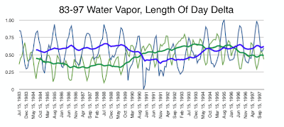 The first correlation runs through the first half of the data, from July 1983 to December, 1997. In this correlation the water vapor (blue lines) and LODD (green lines) are mirror images of each other. As one goes up, the other goes down. This is true both at the monthly level and at the 13 month smoothed trend.
Water Vapor And LODD, 1998 To 2008
 The second correlation runs through the second half of the data, from January, 1998 to June, 2008. In this correlation water vapor (blue lines) and LODD (green lines) follow each other in the 13 month smoothed trend, even though at the monthly level they are still have reversed trends.
What's It All Mean?
The honest answer is "I don't know". Maybe there's something to this, maybe not. But the two correlations seem pretty clear.
One thing that jumps out at me is that 1998, when the new smoothing trend starts, is when the Earth stopped warming.
I'll continue to research this to see what I find and post updates here.
References:
Earth Orientation Centre Length of Day Delta (LODD) data
Stunning New Climate Correlation
Climate Scientist Starter Kit Spreadsheet
What I found is the correlation is not as good as I first thought it was. Or maybe a better way to say it is the correlation is different than I first thought it was. There seems to be two correlations in the data.
Just to be clear, I'm not suggesting that changes in the LODD are causing changes in water vapor. I'm pointing out that there are correlations between the two data sets.
What Is Length Of Day Delta (LODD)?
Let's start with an explanation of what the Length Of Day Delta (LODD) is. Simply put, the LODD is a measure of how much extra time is added to each day. A "normal" day has 86,400 seconds. However, in practice, there's no such thing as a normal day. Each day has a few more or a few less milliseconds. The extra amount of time, which can be positive or negative, is the LODD.
Water Vapor And LODD, 1983 To 2008

As you can see, the correlation doesn't look as nice as when I just overlaid two graphs in my previous post. Specifically, in the early years water vapor is not matching LODD. I was a bit bummed out when I saw this, thinking a correlation that looked so promising turned out to be nothing.
But I kept looking and found something else: two correlations.
Water Vapor And LODD, 1983 To 1997

Water Vapor And LODD, 1998 To 2008

What's It All Mean?
The honest answer is "I don't know". Maybe there's something to this, maybe not. But the two correlations seem pretty clear.
One thing that jumps out at me is that 1998, when the new smoothing trend starts, is when the Earth stopped warming.
I'll continue to research this to see what I find and post updates here.
References:
Earth Orientation Centre Length of Day Delta (LODD) data
Stunning New Climate Correlation
Climate Scientist Starter Kit Spreadsheet
Monday, February 1, 2010
Stunning New Climate Correlation
I just discovered this and simply had to post it. It's an amazing correlation between water vapor in the Earth's atmosphere and changes in the Earth's rotation measured in milliseconds! I know. I know. It's insane to think changes of a few milliseconds could somehow be related to the total water vapor in the air. But here's the chart:
 The blue line is changes in the Earth's rotation as measured in milli-seconds. The red line is changes in the total amount of water vapor in the Earth's atmosphere. The graph covers a 24 year period from 1983 through 2007.
The information for changes in the Earth's rotation comes from the U.S. Naval Observatory. The information for changes in the Earth's water vapor comes from the International Satellite Cloud Climate Project. You can graph the cloud data using the Climate Scientist Starter Kit and your favorite spreadsheet program.
I don't know what this means yet. As I said, I only just now discovered it. But I wanted to get the information out there so people can see it.
Rest assured that future posts will look into this more deeply.
References:
U.S. Naval Observatory Leap Seconds
International Satellite Cloud Climate Project
Climate Scientist Starter Kit

The information for changes in the Earth's rotation comes from the U.S. Naval Observatory. The information for changes in the Earth's water vapor comes from the International Satellite Cloud Climate Project. You can graph the cloud data using the Climate Scientist Starter Kit and your favorite spreadsheet program.
I don't know what this means yet. As I said, I only just now discovered it. But I wanted to get the information out there so people can see it.
Rest assured that future posts will look into this more deeply.
References:
U.S. Naval Observatory Leap Seconds
International Satellite Cloud Climate Project
Climate Scientist Starter Kit
Thursday, January 28, 2010
Climate Scientist Starter Kit Working With Curves
Shows how to use the Climate Scientist Starter Kit to work with curves so common to climate data.
This video has been placed in the public domain.
Tuesday, January 12, 2010
Getting Back To Normal
I think at this point I've gotten out all the information I've wanted to on the climate in general and ClimateGate in particular. That means I'll be going back to the physics code I was doing before ClimateGate broke. I want to thank all the folks who've been reading, who downloaded the Climate Scientist Starter Kit, and especially the 50,000+ people who watched my ClimateGate Who's Who video on YouTube.
I'll probably be getting back to the climate this spring when the EPA tries to push cap and trade. Till then, I need to concentrate on my physics code.
Thanks again everyone.
I'll probably be getting back to the climate this spring when the EPA tries to push cap and trade. Till then, I need to concentrate on my physics code.
Thanks again everyone.
Friday, January 8, 2010
Climate Scientist Starter Kit, Version 1.5
The Climate Scientist Starter Kit has been updated to version 1.5. There's lots of new data and this video explains what you'll find.
This video has been placed in the public domain.
Sunday, January 3, 2010
Climate Scientist Starter Kit Simple Data Analysis
This video shows you how to do some simple data analysis with the Climate Scientist Starter Kit spreadsheet. It includes an example of re-creating Svensmark's cosmic ray and tropospheric temperature graph.
This video has been placed in the public domain.
Saturday, January 2, 2010
Climate Scientist Starter Kit Introduction Video
This video is a walkthrough and explanation of the data found in the Climate Scientist Starter Kit spreadsheet.
The video has been placed in the public domain.
Friday, January 1, 2010
Climate Scientist Starter Kit In Action

The above chart shows a sample of what you can do with the Climate Scientist Starter Kit. It shows the Global Mean Temperature anomaly (red) adjusted for TDYN, ENSO, and Volcano effects, compared to the low level cloud cover (blue). Both data sets are monthly data for the period from July, 1983 to June 2008. Both sets show the trend line for the data.
As low level clouds go down, the temperature goes up.
Happy New Year. :)
References:
Climate Scientist Starter Kit
Thursday, December 31, 2009
Climate Scientist Starter Kit

I've just put together a Climate Scientist Starter Kit. The kit contains a spreadsheet in Apple Numbers and Microsoft Excel formats. The spreadsheet has data on:
* Monthly Global Mean, TDYN, ENSO, and Volcano temperatures from January, 1900 till March 2009.
* Monthly UAH satellite temperature data from December, 1978 till November 2009.
* Daily and monthly Cosmic Ray data from January, 1951 till November, 2006.
* Monthly low level cloud data from July, 1983 through June, 2008.
* Ice Core CO2 data and monthly CO2 data for the years 1958 through 2008.
It nice because you have all the data in an easy to use spreadsheet, rather than having to parse up various data formats.
There's also supporting data, including raw cloud data, daily cloud data, C++ code for parsing raw cloud data files, and HTML documents that provide additional information.
You can download the zip file here. NOTE: The comment on the download page will say it's the FreePOOMA Add-On Pack. Don't worry, that's just the name of the project that contains the zip file.
Feedback for improvements for future versions of the kit is welcome.
References:
The Climate Scientist Starter Kit
Subscribe to:
Posts (Atom)

 Posts
Posts


